| State of the Art |

Theo Wood reveals the secrets of Ann Hughes' QL graphics
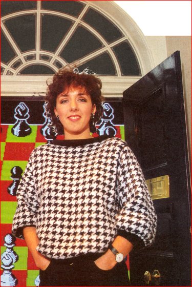
QL CHESS was one of the games software high points of 1984, a year which included the state-of-the-art Match Point. Both games were produced by Psion. Both games featured graphics designed by Ann Hughes.
The company began in Huntsworth Mews, London - a small informal office packed to the gills with desks and people. The new base in Dorset Square is in direct contrast, an elegant Georgian house swamped with pile carpet.
Ann Hughes works here - one of a team of three graphic designers who have joined Psion over the past year. Ann is typical of many graphic designers; trained to use methods involving paper technology she is discovering that a knowledge of computer graphics is an almost indispensable skill in the commercial world.
Just before starting at Psion in October 1983 she had been working as a freelance stage designer, wielding massive brushes which could scarcely have been further from the pixel resolution required in a microworld.
She had no experience of using computers: "I didn't know one end of a computer from another; I thought a pixel was a pistol." Her first work for Psion, designing the QL manuals and working on cassette packaging was little different from her previous training. The only problem was a lack specialist graphic equipment to reproduce diagrams and charts. That was soon remedied.
Match Point was her first challenge in designing for the screen. "The game came to me with the dimensions of the court laid out so there wasn't very much to do in designing the game itself. Most of the work went into the design of the characters."
Ann found the limitations of screen design very frustrating in that the Spectrum screen attributes allow only two colours. When animation was introduced the problem became worse, and there was also the memory limitation to be considered. Tackling even a minor problem, like the movement of the heads in the crowd, had to be subject to an ingenious solution, "I did just two screens and narrowed the heads to make it look as if you were seeing their profiles, and then flicked them. There wasn't much else to do within the memory."
The animation of players and ball boys was done first on graph paper, colouring in the individual pixels, with eight positions for the ball boys and ten for the players. Steve Kelly - driving force behind the classic Chequered Flag - then wrote an animation program on a Vax computer which would remember the individual characters, send them down to the Spectrum and then run them in a sequence.
Initial results were not spectacular. "It was really funny though, as I'd not done animation before, and at first when the characters ran, they were doing some dreadful things ... Some had peglegs," Arm laughs.
The title screen had its own particular difficulties. "This took the most blood, sweat and tears, and is what I would count as the most graphic thing. The skin tones were very difficult - I used a photograph and tried pixellating it to scale. I started with one version and then modified it. One aspect that really killed me was when he was holding the racket and I wanted the handle part to be a different colour. Then there was his hand and the background, so that was three different colours in one attribute. So I had to put it on the edge of an attribute and that meant that his arm might be too long. I had to really play around with those features."
Ann went on to design the title screens for the educational games Estimator Racer and Number Painter.

Then it was Chess for the QL. There was no software available at the time, and to remedy that Steve Kelly wrote a graphics program providing the facilities that Ann required. Nicknamed QDraw, the program is on microdrive and has a number of useful functions - enlarge/reduce, alter pen size, and patterning are just some. Designs can be SAVEd on microdrive.
QDraw is obviously a powerful graphics package but QL users will have to live in hope, as what can be used as an in-house design program still requires a great deal of work before it can be introduced to the market. Psion has no immediate plans to do that.
Ann found it was with this program that pencil and paper became redundant. 'When I started I was so used to paper and pencil that I couldn't relate to the screen at all," she explains. "I did everything on graph paper, but when you draw on paper you don't get the same effect, as the light out of the screen tends to flatten everything. Now that I'm used to it I do most of my designing straight onto the screen."
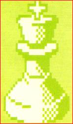
One of the most useful facilities QDraw gave Ann as a designer was the ability to replicate pieces behind and on top of other pieces as well as to move them. That gave her the power to see how each piece would look behind or in front of another in various stages of play.
The problems of white pieces on white are obvious and the same goes for black on black, but Ann found that the white/green and black/red combinations also suffered from lack of definition. A black line round the white pieces, and white round black, was used to overcome the difficulty - something she would not have done in an ordinary drawing. That technique is only used when necessary and the lines disappear otherwise.
Colours were a source of frustration: "It is totally restricting, coming from something where you have everything at your fingertips and to be told that you have to work in squares and you can't mix colours." Ann 'mixed' colours for the base of the board where she tessellated black and red to gain a similar effect.
Problems cropped up. "I started off by doing the pawn and did it much bigger because I wanted the pieces to really fill the screen. But then there was an overlap so I had to redo all the pieces I had done until then, as I started trying out the relationships."
Ann also designed the display board on the flick screen which records the moves made. That, unlike the playing board, is in 2D. But it is the 3D effects which are the most stunning, although Ann is self-deprecating: "Let's be frank. This QL gives me so much more. I don't necessarily think it's an advance because of what I have done."
Ann feels that the way forward for computer graphics will be towards higher resolution at lower cost. That means more realistic animation will be possible, and it is that aspect of computer graphics which interests her most.
She also feels that there will be a radical change in cassette packaging based, in many cases, on the 'cosmic' art of the '60s. Psion has gone through this change, exemplified in its logo which is now more abstract.
Her current work is mainly translations of various programs to other machines, and Chess will be translated for machines such as the IBM and Macintosh. Ann Hughes however is not someone to rest on past glories and although already highly qualified as a graphic designer she wishes to perfect her work; she is attending a computer graphics course which will involve using programming techniques.
For would-be designers she recommends starting with a drawing package and using graph paper to work out animation sequences. And, "Be patient, that's the main thing really."